Myself and another Experience Designer were tasked to uplift the existing 'Owners' page for Toyota's dotcom experience.
The Owners page went through 'Discovery' and 'Define & Design' phases with Experience Design, SEO, Marketing Science, Visual Design and Copywriting teams.

UX activities
-
User interviews
-
Card sorting
-
Usability testing
-
Wireframes
-
Discovery & Define presentation
Considerations
-
Include existing video assets
-
Incorporate Toyota's entire value chain
Myself and another Experience Designer were tasked to uplift the existing 'Owners' page for Toyota's dotcom experience.
The Owners page went through 'Discovery' and 'Define & Design' phases with Experience Design, SEO, Marketing Science, Visual Design and Copywriting teams.
The opportunity
Become a personalised and trusted educational guide that helps guests discover content, products and services suitable to their unique journey: lifestyle, lifestage and ownership stage
UX activities
-
User interviews
-
Card sorting
-
Usability testing
-
Wireframes
-
Discovery & Define presentation
Considerations
-
Include existing video assets
-
Incorporate Toyota's entire value chain
The opportunity
Become a personalised and trusted educational guide that helps guests discover content, products and services suitable to their unique journey: lifestyle, lifestage and ownership stage
My work
ACMI: Optimising 'The Lens' onboarding
The brief
Optimise the uptake, onboarding and engagement of the Lens (a physical hand held museum device) with existing constraints
The solution
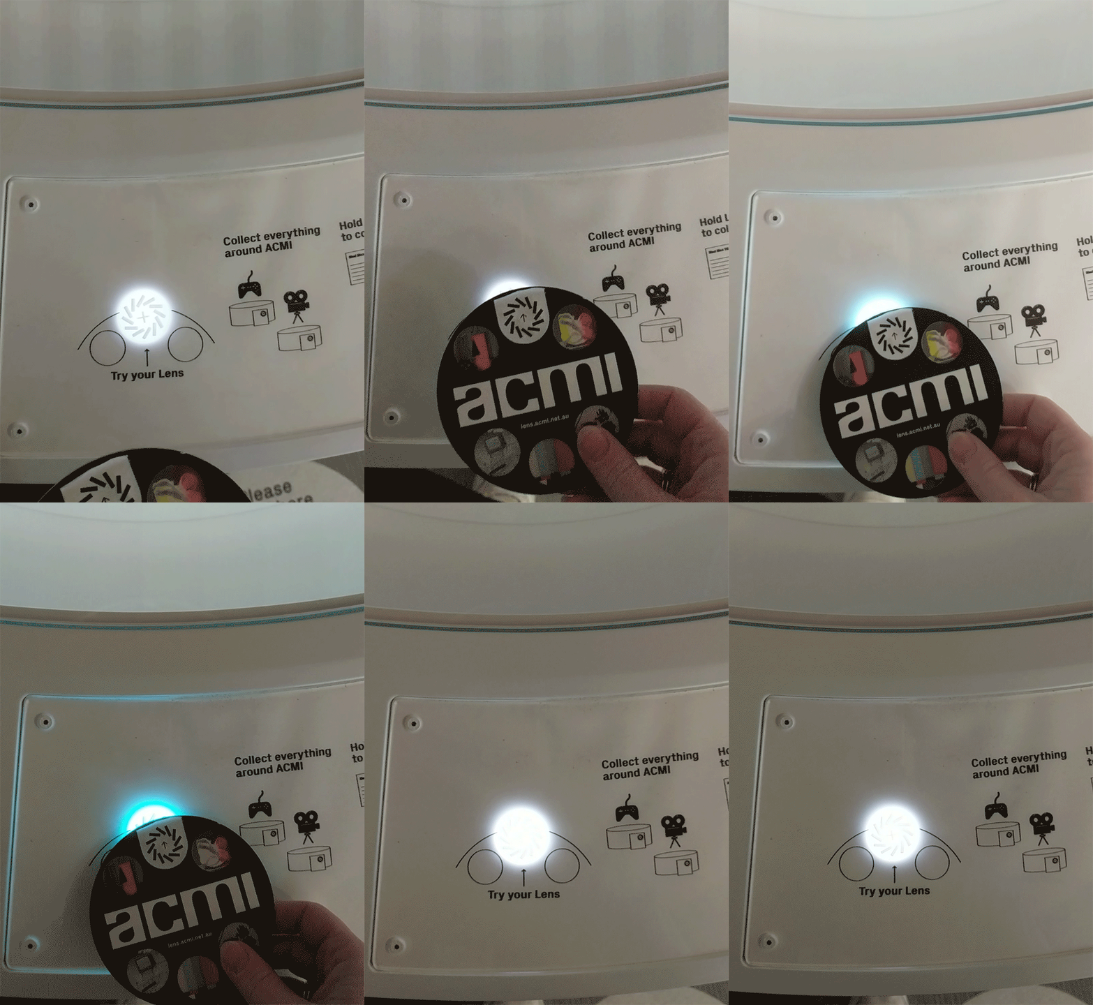
An iterated onboarding station with new messaging and more inclusive lighting feedback to help new visitors
UX methods
Observational research and contextual enquiries, research synthesis, mid-fi prototyping and usability testing.
Deliverables
Updated instructions at onboarding station and messaging for the Lens device, colour blind accessible lighting feedback
Background
The Lens is a handheld device visitors take at the beginning the centrepiece exhibition, The Story of the Moving Image.
By tapping one of many readers around the exhibition, visitors can collect anything on display (and interactive experiences) in ACMI’s centrepiece exhibition. After they leave, visitors can log in online with their Lens code and see everything they've have collected / made.
The Lens and this experience is a relatively new concept for visitors to Museums and galleries.
The Problem
The onboarding station at the entrance of ACMI Museum's permanent exhibition was not effectively explaining how the Lens works, leading to confusion, congestion, less uptake and pressure on the visitor services team to guide new visitors.
We needed to:
-
help onboard visitors quickly
-
explain the value proposition
-
provide visitors with the information most useful so they can move into the exhibition with the confidence to start collecting

Lens dispenser
Lens (NFC) reader
Printed instructions on A3 size paper would sit underneath glass with 2 x lens readers on either side
The process
User research: contextual enquiries
To understand the issues with the current onboarding station, I conducted 3 rounds of observational research and contextual enquiries with 3 small groups. I observed and recorded their interactions, and gathered feedback on the design and overall user experience.
Findings
My observations revealed these groups were having difficulty using the onboarding station, with many struggling to understand how to access the various exhibits.
Wireframing and User Testing
Based on findings, I created wireframes for the onboarding station. The design focused on improving the user experience by incorporating clear and concise instructions, clearer directives to 'Take your Lens' at the dispenser, clearer instructions on the Lens device itself, and update lighting feedback for when visitors tested their Lens. I also conducted user testing with a diverse group of visitors to gather feedback on all of these changes and the design and overall experience.
The result
The redesigned onboarding station received positive feedback from visitors and staff during user testing and was implemented in the first 2 months of the museum's reopening. Visitors are now able to navigate the museum with ease and are more engaged with the exhibit via the Lens.
The updated station led to a reduction in confusion, resulting in a better overall experience for visitors and for the Visitor Service team. This led to increased engagement with the exhibit and a better overall experience at the museum.
Changes made
-
Updated instructions at onboarding station
-
Changed the success /error colours of the Lens readers at onboarding and inside the exhibition to be more colour blind accessible
-
A clearer CTA for visitors to take a Lens
-
Updated messaging on the Lens device

.png)
Changes made
Success / error lighting

A successful tap: a steady flash of blue

An unsuccessful tap/error: a quick flash of blue followed by amagenta colour flashing 3 times
Changes made
CTA on The Lens dispenser


Changes made
The Lens: Design and copy

